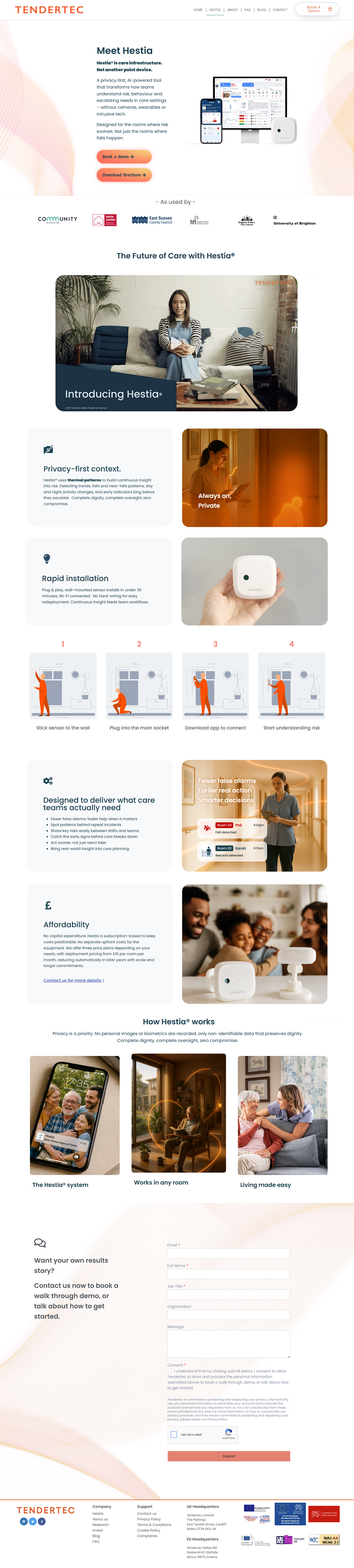
Increased Healthcare SaaS Conversions by 46% Through Funnel Redesign
Identified drop-off points using funnel analytics and UX journey mapping to improve conversion and engagement
Role
Solo Product Designer (UX/UI)
Collaboration
PM & marketing team
Duration
3 months
Context
| Traffic Without Conversion
A healthcare SaaS platform was getting the traffic, running the campaigns, but not converting. Visitors were landing and leaving.
I was brought in as the UX researcher and designer to diagnose and fix the issue, partnering closely with the PM and marketing team to align user needs with business goals and turn a leaking funnel into a performing one.
The platform served three distinct audiences, including care providers, hospitals, and families, each with different needs and different levels of trust. Getting the experience right wasn’t just a conversion problem. It was a clarity and trust problem, and that made the design work genuinely complex.
Opportunity
The core issue was not attracting users,
it was converting them.
The experience overwhelmed users with options, unclear navigation, and content-heavy pages, making it difficult to decide where to go next or feel confident enough to take action.
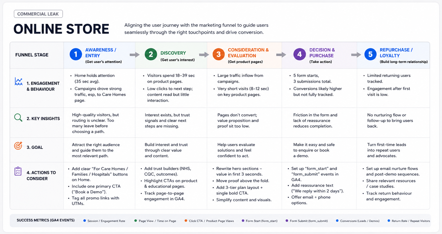
- Two-thirds of visits landed directly on the Care Homes page, yet users spent an average of just 12 seconds there.
- It indicates that Users were hesitating to act due to unclear direction and a lack of trust signals.
- Across roughly 1,000 sessions, only 3 lead submissions were completed.
- The drop-off was sharp, consistent, and happening at exactly the moments that mattered most.
Trust First, Conversion Second
Guide users clearly through the funnel
Align user journeys with business conversion paths, reducing ambiguity and drop-offs.
Reduce cognitive overload
Simplify navigation, messaging, and page structure to help users make decisions faster.
Build trust early
Introduce proof points, clear value propositions, and reassuring messaging within the first interaction.
Methods
Combined funnel analytics with UX journey mapping to identify where users hesitate versus act, sharing insights regularly with PM and marketing to prioritise the highest impact fixes
- Engagement metrics (time, drop-offs)
- Entry source analysis (campaign vs organic)
- Page-to-page transitions
| From there, I redesigned three critical surfaces:
- Homepage (trust and entry points)
- Product pages (value and use case clarity)
- Forms (reduced friction, added reassurance
I also work with marketing team to define a GA4 measurement framework, tracking form_start, form_submit, and CTA clicks. So the business could see conversion performance clearly for the first time.
Outcomes
The redesign delivered across every metric that mattered:
- Conversion rate up 46%
- Engagement up 70% (time on page and interactions)
- Higher lead quality, with more qualified demo requests
- Reduced drop-off at key decision pages
- Increased CTA click-through rates
- First clear attribution of lead sources via tracking setup
Key learnings
- Funnel performance is rarely a surface-level UI issue, it is usually caused by deeper breakdowns in information flow and decision clarity
- User behaviour data becomes most valuable when mapped directly to journey stages and friction points
- Small changes at key decision moments can have an effective impact on overall conversion and engagement
- Designing for conversion is not only about increasing clicks, but also improving the quality of user intent and lead outcomes
- Clear attribution and tracking early in the process are essential for understanding what actually drives performance improvements